art saat
Art Saat
Art Saat represents some of Colombia’s most respected art curators and has positioned itself as a first class gallery for showing groundbreaking contemporary art by both leading and emerging artists from Latin America.
The gallery is in a unique position, representing some of the countries leading and most prominent artists that have a large following not only within Latin America but also abroad. The careful curation and smart positioning of these artists requires a very sophisticated understanding of the art world and more importantly, it requires a precise mastery of the relationship between Latin American Art and other cultures around the world.
When we began to work with Art Saat, we understood that a big part of our design work would have to revolve around a multicultural communication strategy. Both copy and design would have to permit spacing and flexibility to present prominent Latin American artists in Shanghai, New York, Abu Dhabi and London, just to name a few.

Exporting Latin American Art
Art Saat has built a reputation for its dedication and support to its roster of artists. They have also differentiated their brand by supporting visionary artistic projects worldwide. Even more importantly, they are currently building a reputation for identifying the best talent of the region and exporting it to other galleries and seasoned curators in Museums all over the world. This is no small feat, and the design work required from us needed to assure that art buyers, traders, curators and gallerists from many different countries and cultures would quickly understand the ethos of the brand creating a close connection with the team of experts behind Art Saat.

A Canvas for Artists
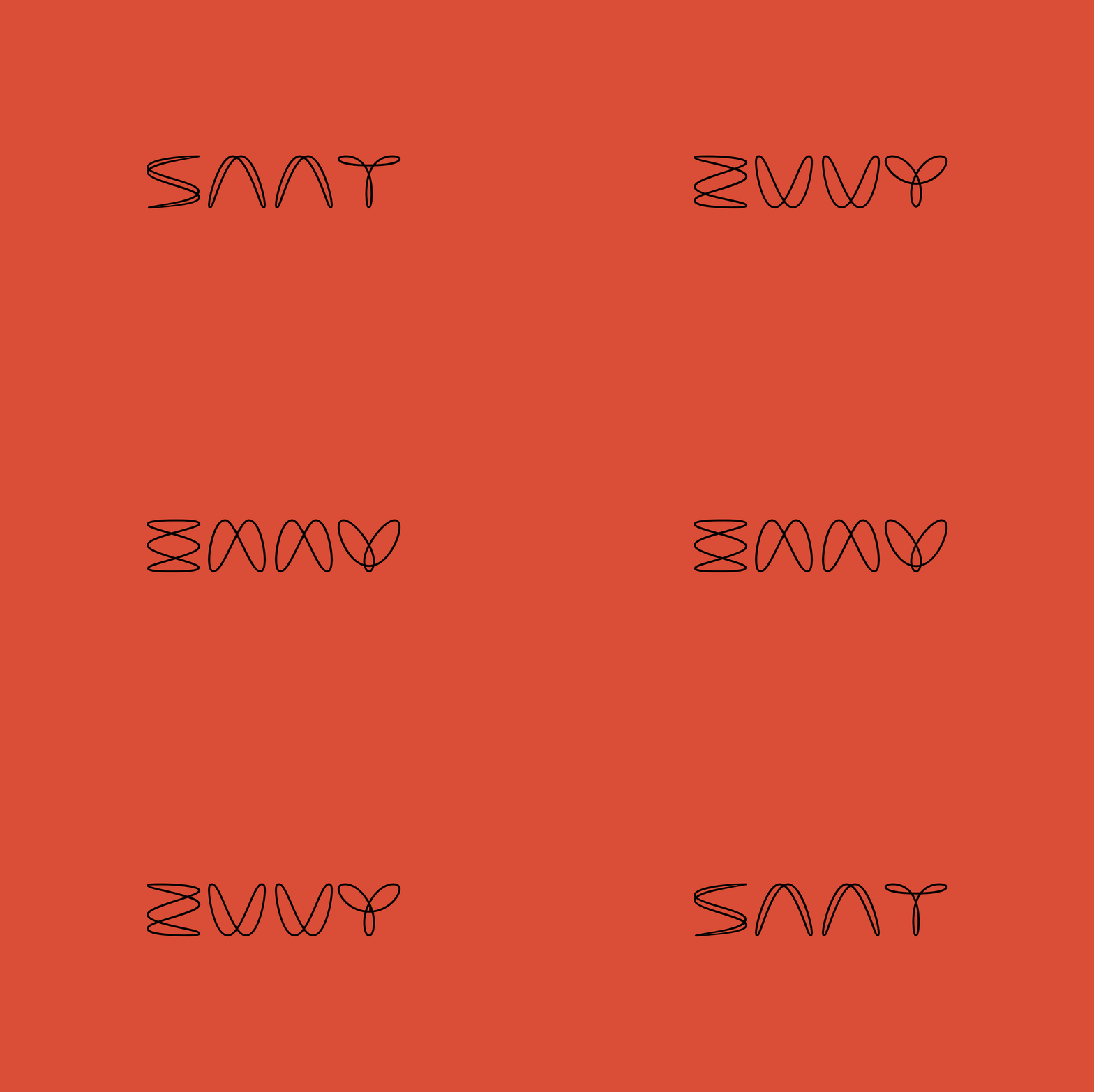
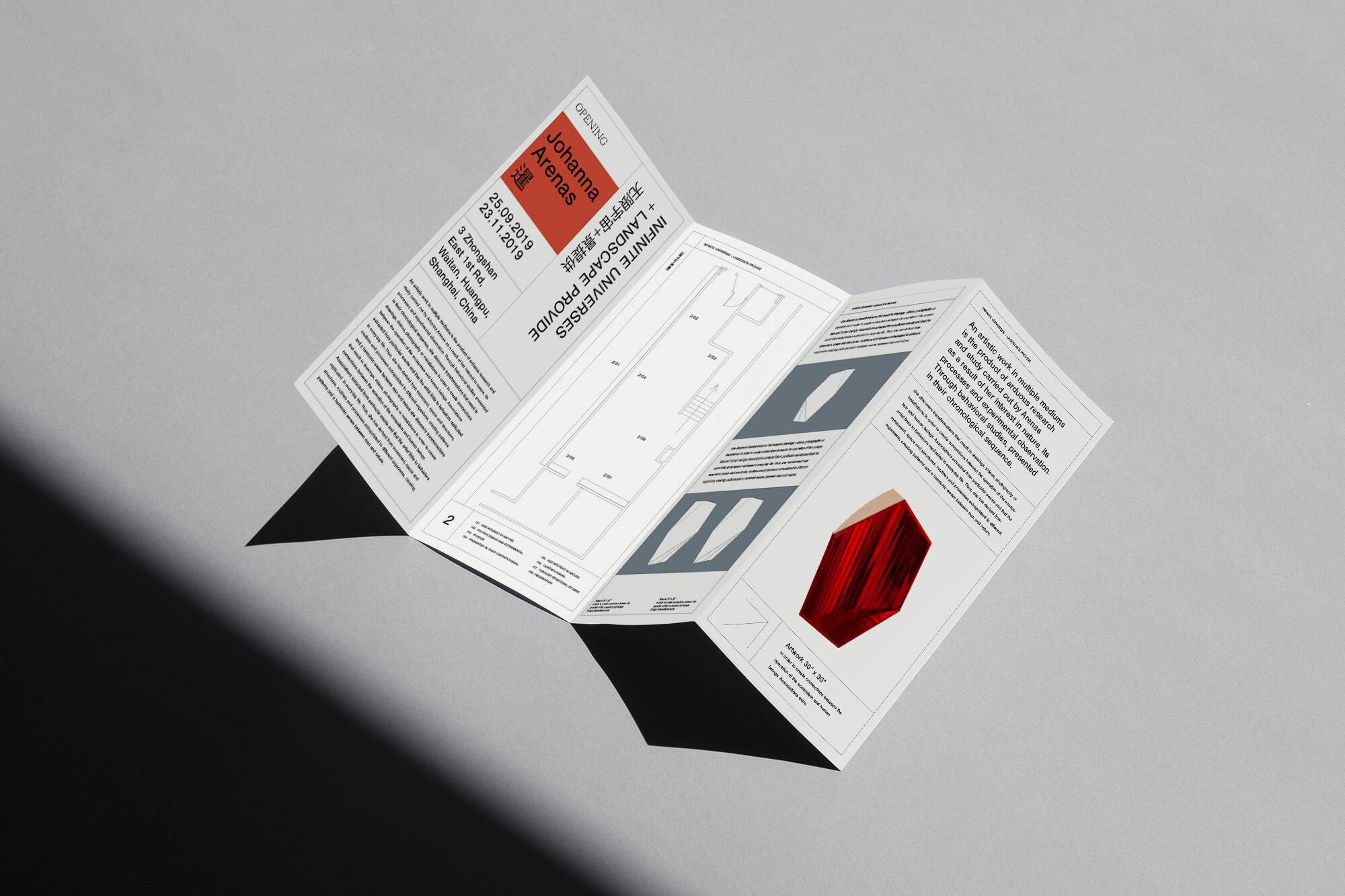
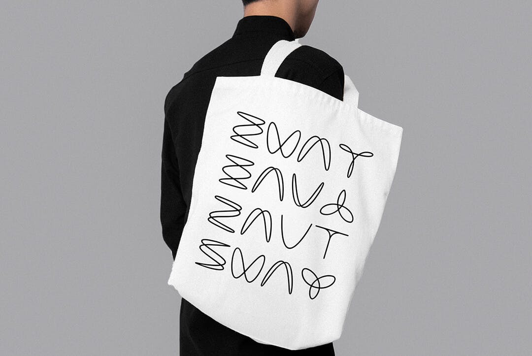
At its core, Art Saat is a truly universal brand that serves to represent the creative work of others. Because of this Art Saat needed to have a simple, flexible identity that could serve as a blank canvas for all different types of content. We designed a grid system that could be applied easily and adjusted depending on image proportions and length of copy (some works are presented in more than three languages). This simplicity was counterbalanced with a unique logo design that invited movement and transformation as part of the building blocks behind the brands aesthetic. For the design of the logo we worked with Bastarda, a brilliant typography studio in Bogotá, that not only perfected the logo typographically but also took on the challenge of creating a special animation that feels soothing and sophisticated at the same time.
