The Beat of Type
The Beat of Type
"Our mind is a machine for pattern recognition. That’s why a well-tuned, rhythmic and proportional text will always triumph over a scrappy one”.
Matej Latin
 The Addams Family, Charles Addams. TV Show, 1964-66.
Rhythm catches the eye with the same ferocity with which it seduces the ear, through repetition and arrangement, presence and absence, beauty and order. Good design harnesses rhythm to soothe the mind - it proposes movement, suggests vitality and offers satisfaction.
The cadence of visual rhythm is set through typographic hierarchies, decisive spacing, and proportionate weights, arranged to create a pleasing and exciting composition. If an infinite amount of variables such as size, placement, form and spacing define rhythm in design, how do we know when we’ve achieved it? Is visual rhythm universal? Does it change from one culture to the next? Just like its auditory counterpart, visual rhythm combines formula with instinct. You know it when you see it, hear it, feel it.
To find the rhythm is to catch a wave, to experience the beat of a logo, a font, a poem, a song, a room, a day, a love, a story, a life.
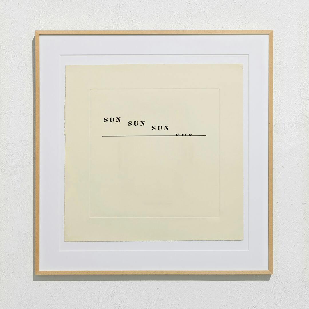
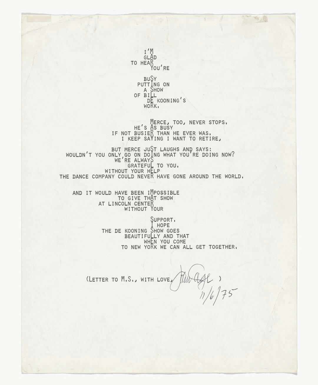 Untitled, John Cage. Letter, 1975.
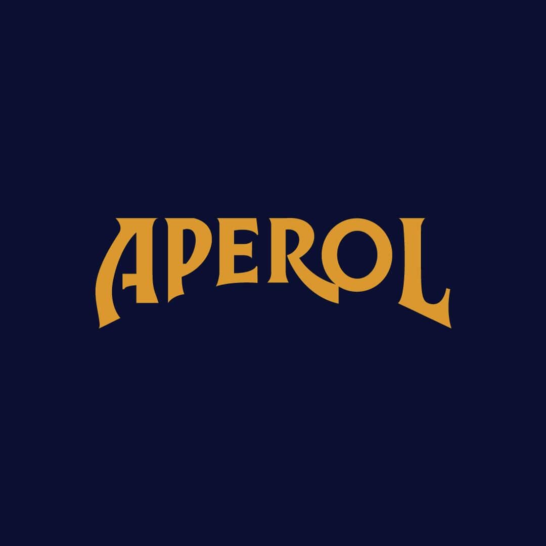 Aperol, Designer Unknown. Logo Design, Circa 1960.
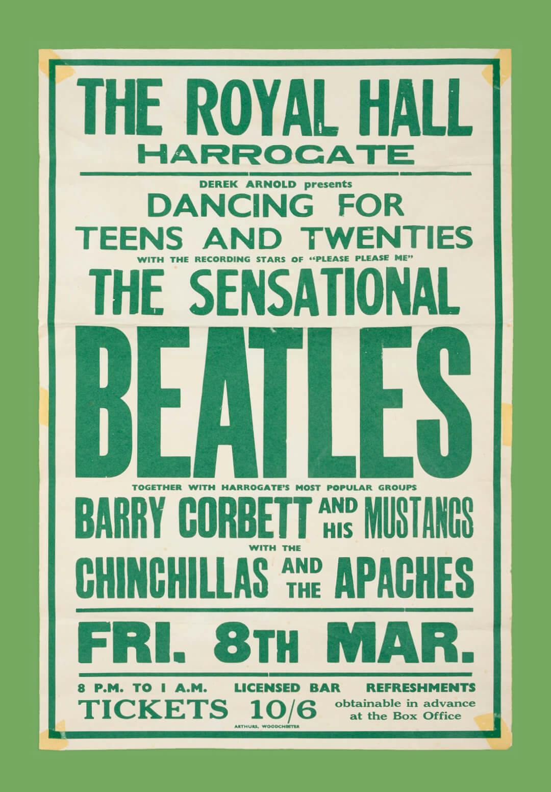 The Beatles at The Royal Hall, Unknown. Poster Design, 1963.
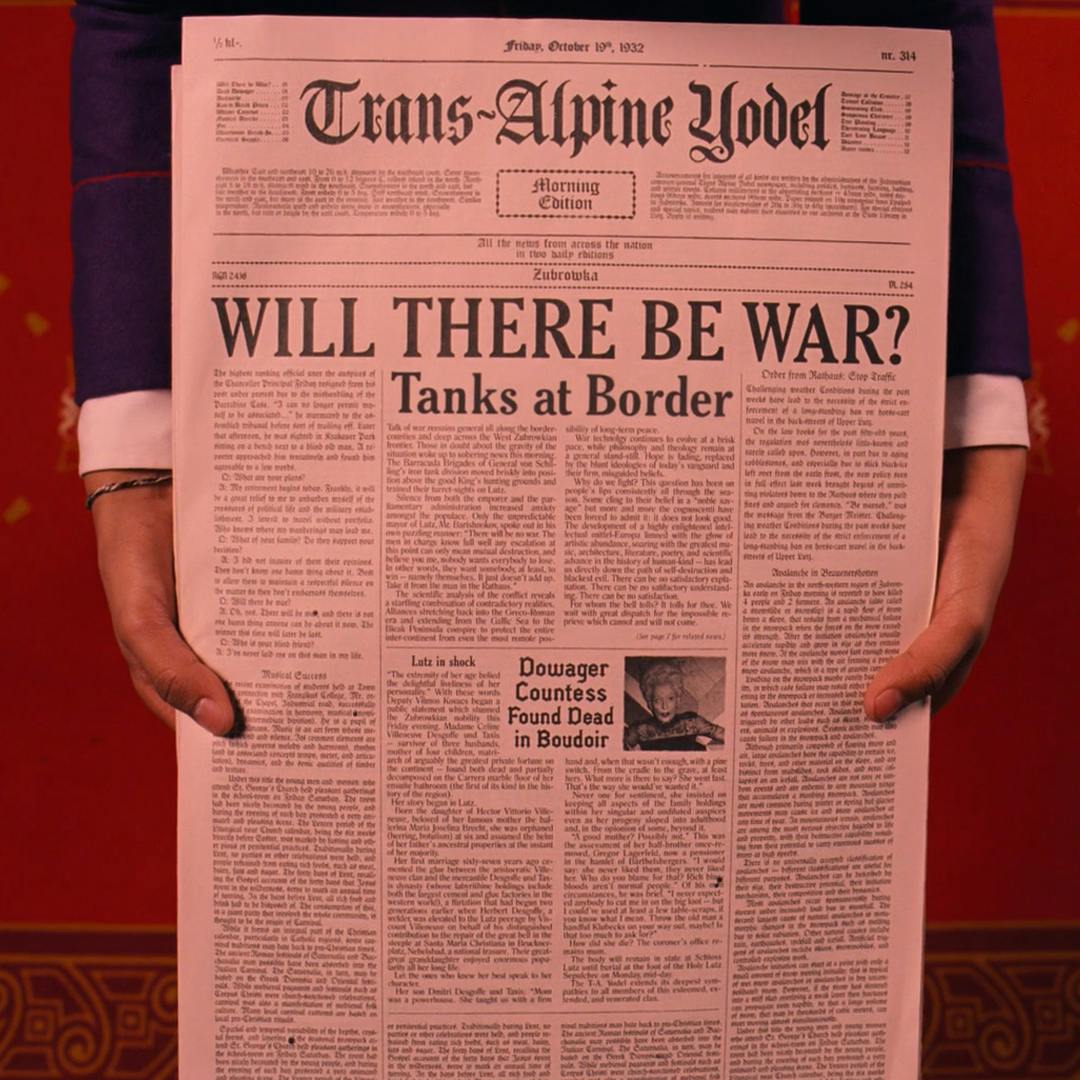
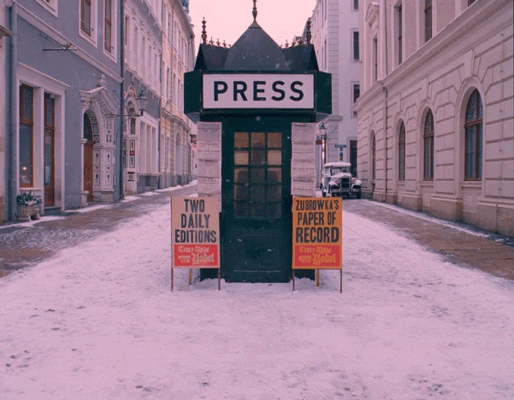 The Grand Budapest Hotel, Wes Anderson. Film, 2014.